Original Post
Recent update changes have changed two functions that now require more click throughs to complete.
Recently Closed Tabs
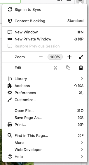
Previously: ☰ History ► Recently Closed Tabs
Now: ☰ Library ► History ► Recently Closed Tabs
It doesn’t make sense to have moved History under Library. I would not have known that the Recently Closed Tabs were there without having to dig around and find them.
Poor decision in my opinion.
Bookmark Tabs
Previously: Right-click Tabs, Bookmark All Tabs
Now:
- Right-click Tabs ► Select All Tabs
- Right-click Tabs ► Bookmark All Tabs
Again, why the added steps? Why not leave the “Bookmark All Tabs” menu option?
I am almost certain there are other UI changes that have lead to poor UX that I myself do not use. Why the unnecessary changes? Change just to change is not a good reason to change. It provided no improved usability and instead, did the opposite.
My Comments
Recently Closed Tabs
Feels like they just wanted a cohesive organization scheme. Why not put History, Downloads, Bookmarks in the main menu, since that would mean less clicks to get to those areas as well? How about Bookmark this page and clear recent history? Unless you just put everything in there, there is going to be some nesting.
Bookmark Tabs
Makes sense to me because it is just an extension of the way the selection process works. Think of your file manager. Is there a delete all feature in addition to “delete”? Or does it ask you to select multiple items to delete multiple items?
If you have good reasons why these decisions don’t make sense and are worse, file them to https://bugzilla.mozilla.org.
Context
This is the menu that the original poster was referring to:

The hierarchical change was undone as part of the Firefox 89 Proton update. Bookmarks, History and Downloads are now top-level menu items in the Firefox main menu.
My own usage of the main menu in Firefox is minimal; I know of the keyboard shortcut to temporarily show the menu bar (press ALT) and use that to find menu items. While my comment to the original poster was a defense of the prior design, I think the original poster and the current design make more sense - I don’t know that forcing users to learn a new abstraction (the Library) is desirable here, especially when it requires more steps to achieve common tasks.
The bookmark all tabs functionality hasn’t been updated since this was first posted, and I think my comment continues to make sense.
If you liked this material, please consider supporting me. You can also message me on Mastodon.